Melanie Ewing, the renowned Chapters Design Academy CEO, talks to us about the latest trends and looks in the fashion and design world.
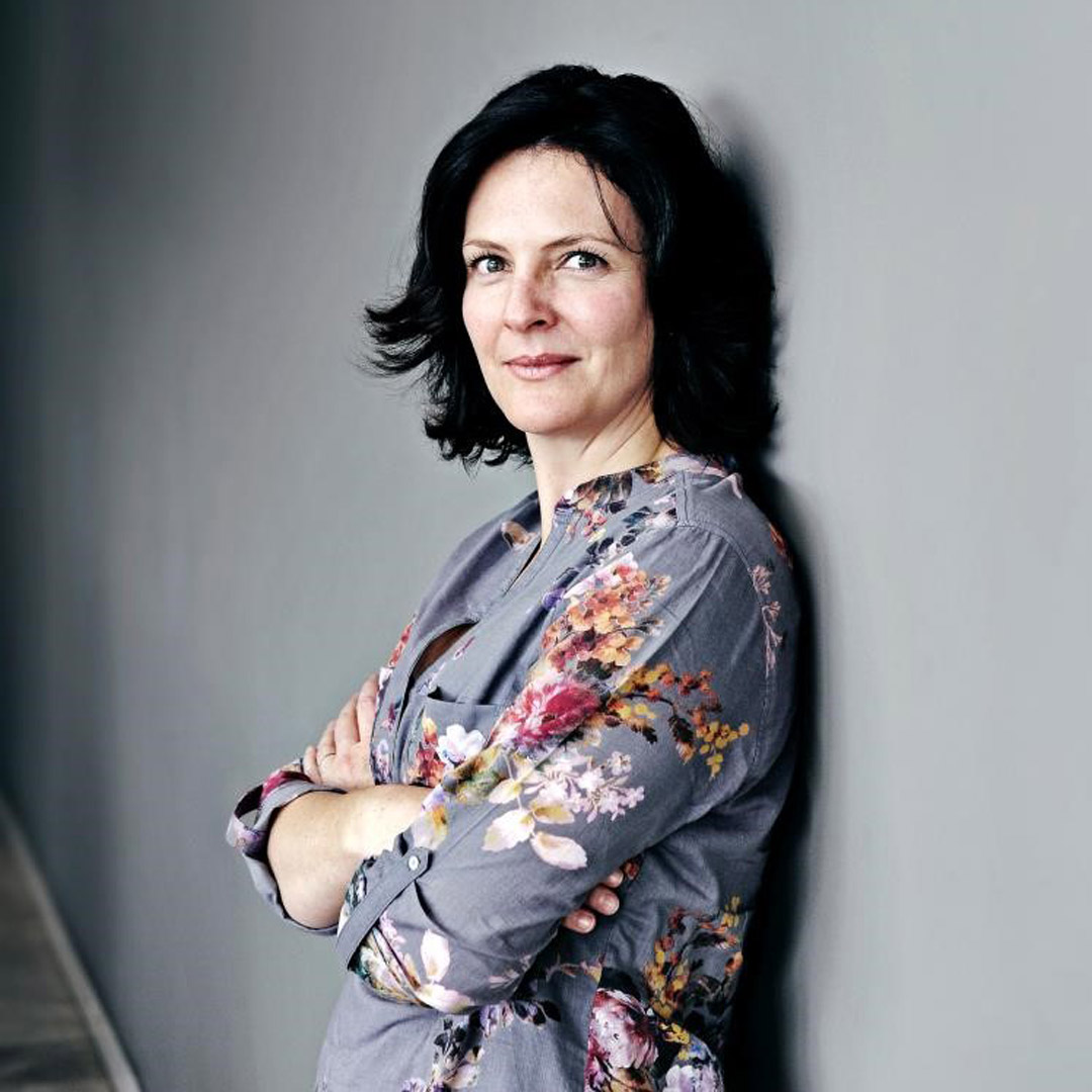
Throughout the Italtile year, ongoing staff training includes regular interior design seminars run by Melanie Ewing, founder and CEO of Chapters Design Academy. In the first quarter of 2020, Italtile consultants from Cape Town, Pretoria, Nelspruit and Umhlanga joined their Johannesburg colleagues for an intensive three-day design course that focused on 2020/2021 trends, and how they are being translated and implemented in the South African context.
Melanie pointed out that trends are influenced by many factors, and often emerge as a reaction to what is happening in society and the world around us. A paradigm shift in society can result in a trend shift. It’s important to note that trends overlap each other and can influence each other. Some have a short lifespan. Others become part of our societal framework and are considered a ‘look’. Then there are the sustainable trends that keep on coming back: they may be slightly streamlined or updated, but they continue to reinvent themselves and return to find a place in our design-loving hearts and homes.
The Pantone Colour of the Year. This is the hue that is chosen to represent the mood or the need of the time. This year, it’s Pantone 19-4502 Classic Blue. Some have termed it ‘anti-anxiety blue’ because it was selected as the calming response to the drama and trauma we face right now. Leatrice Eiseman - Executive Director of the Pantone Colour Institute – introduced their 2020 colour with these words:
“We are living in a time that requires trust and faith. It is this kind of constancy and confidence that is expressed by Pantone 19-4502 Classic Blue, a solid and dependable blue hue we can always rely on. Classic Blue provides an anchoring foundation. A boundless blue evocative of the vast and infinite evening sky. It challenges us to think more deeply, increase our perspective and open the flow of communication”.
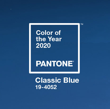
Certainly, this fearful time of COVID-19 isolation has need of all our trust and faith.
We believe this beautiful and timeless choice was nothing short of prophetic!
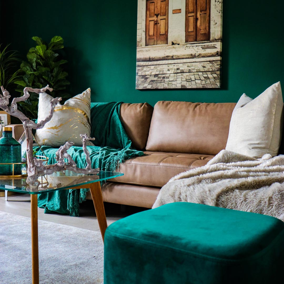
Colours are the New Neutrals. Designers will be walking away from the ‘universal safety’ of neutrals and adventuring into warm colours, saturated hues and jewel tones. With winter coming, these will add richness and fire to our homes – think bright tiles, colour in cabinetry, a painted or tiled feature wall, colourful rugs to add personality to a neutral floor, cheerful woven, knitted or velvet throws in burgundy, saffron, teal, ginger, fuschia.
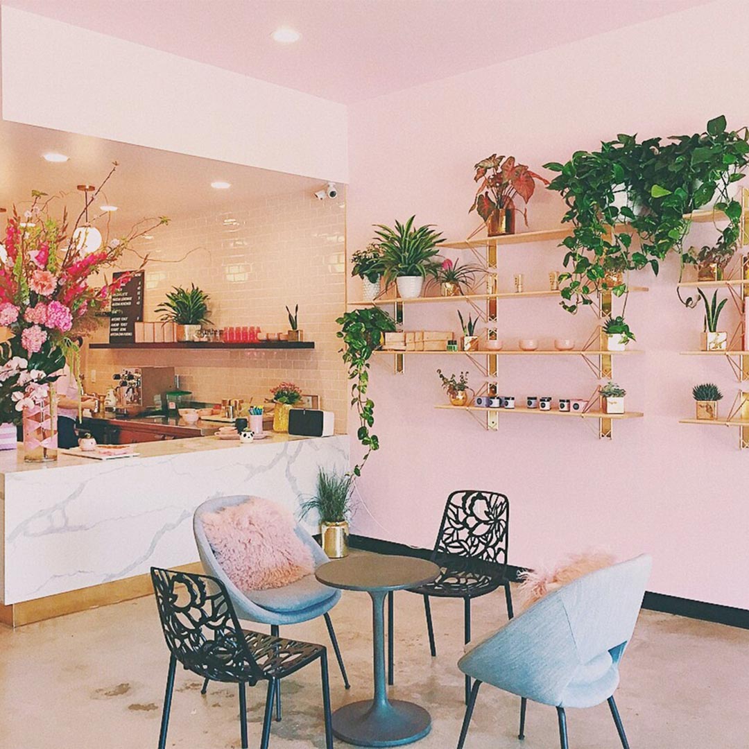
Out goes Grey on Grey… the 2010s were awash with families of grey living together. In come the feminine tones… shades of lighter, more sophisticated pink, an evolution of the more candyfloss millennial pink. These tones take pink into more ‘thoughtful’ areas, with a sense of taupe, or bronze, or old rose, or blush; they will work beautifully to create calm, quiet spaces.
Patterned Everything is In. The key to this trend is there aren’t any rules. Pattern, especially layered patterns, will become more prevalent. Statement Tiles. Go boldly! Patterned tiles are being used in a small way (kitchen backsplash) and in big projects (floor-to-ceiling in bathrooms).
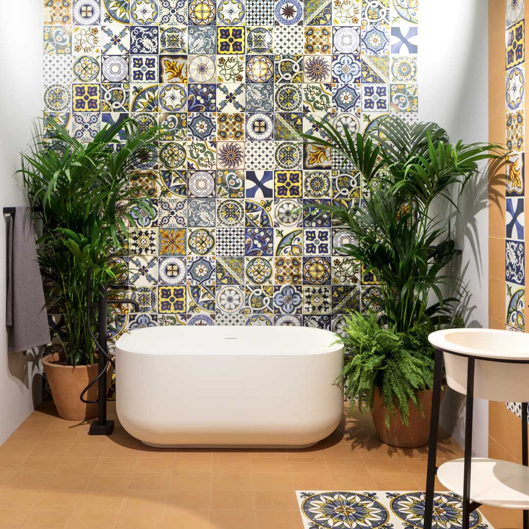
Natural Luxury. Best described as a Spa-like look (which Italtile really rocks!).
Seen in natural materials like marble finishes in bathrooms and kitchens, and marble accents like bowls, coffee table surfaces and candleholders, even linen designs.
We’ll see the return of plaster and lime-wash, raffia, cane, wicker, grass matting and coir, and raw and rustic woods.
Real Plants: It may seem extraordinary to most of us, but indoor plants filter our air, and apparently raise our well-being by helping to reduce stress and anxiety. Certainly, they add personality and another layer to a space. So, bring the outdoors in!
Cool Tones are Out… these can lend an institutional atmosphere to a house and don’t work well with the desire to create a layered space full of personality. Warmth and saturated colour is coming back into our lives. Earth Tones are In… shades of chocolate, wine, olive and yellow ochre are taking over. Colours and textures in the interior finishes will mimic those of nature’s most basic elements: wood, clay, earth, metals, foliage (forest greens). These tones and textures create a zen-like environment in which we can unwind after the day’s stress.
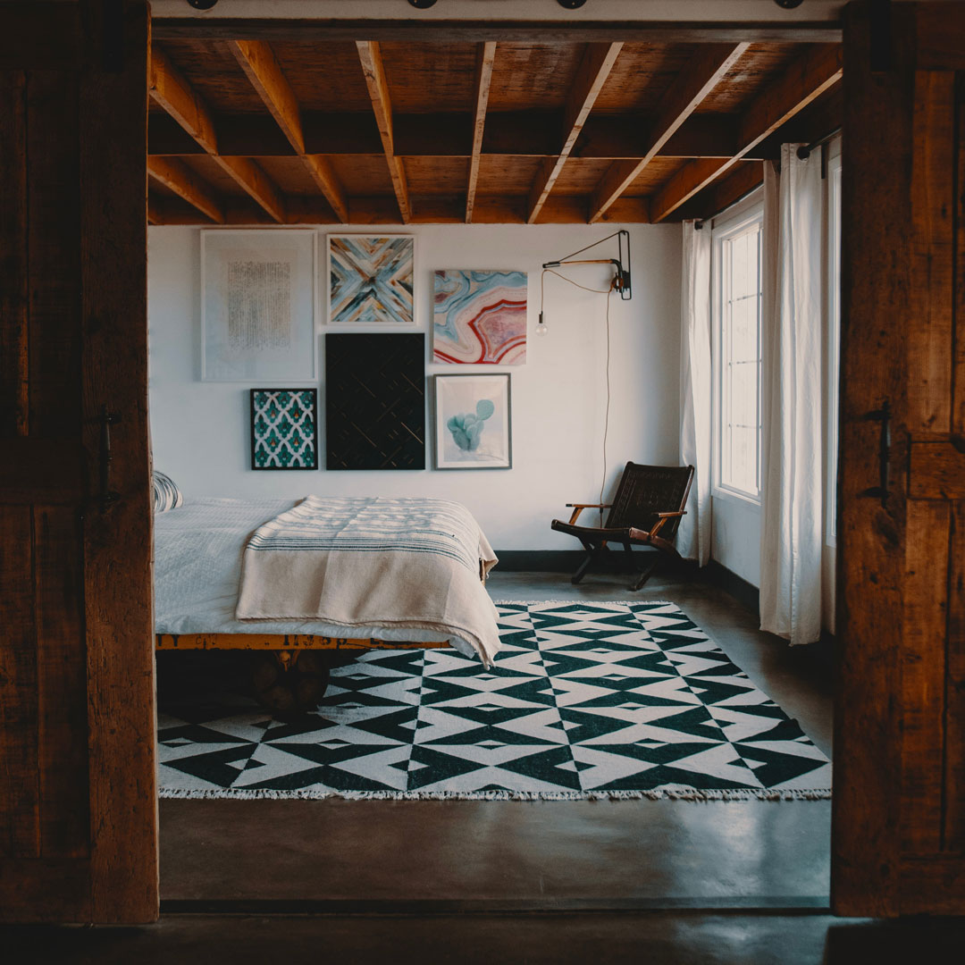
Green. As we embrace all the natural earth tones and sustainable home accessories, it makes sense that we incorporate splashes of green, too.
It’s fresh, and restful on the eye, even in dusty tones – from olive to pistachio. (Muted greens work well for those who generally prefer neutrals.)
Biophilia. 21st century living may be all about high tech, AI and the Internet of Things, but 2020 is all about getting back to nature and giving back to nature. This is a new trend that incorporates human design and natural elements that don’t look ‘manufactured’. (Think vertical wall gardens, recycled woods for chairs, tables and floors.) We are in the middle of a climate crisis and finding sustainable ways to live a stylish life should be front and centre in our design mood boards. (Italtile is the home of Eco Chic living with its LiveGreen logo: awarded to products that best represent a more carbon neutral footprint.)
Handmade. In response to a world looking to return to its roots, there will be a continued focus on handmade goods that have a connection to the maker. Consumers are searching for meaning, and will choose companies and artisans whose products have a story and a point of view, rather than mass-made pieces.
Fun Bathroom Design. Pops of colour, unusual materials and wallpaper, quirky mirrors. Experiment and have fun!
Terrazzo Everything. Terrazzo is not just for airport floors anymore! Developed in renaissance Venice for the nobility (artisans took leftover marble, mother of pearl and glass chips, pressed them into cement, and then polished the surface to a high sheen full of glitter and sparkle); terrazzo now comes in a magnificent variety of aggregate colours, shapes and sizes. It’s now on floors, walls, shower curtains, crockery and even bed linen. It has become glamorous, fun and exciting.
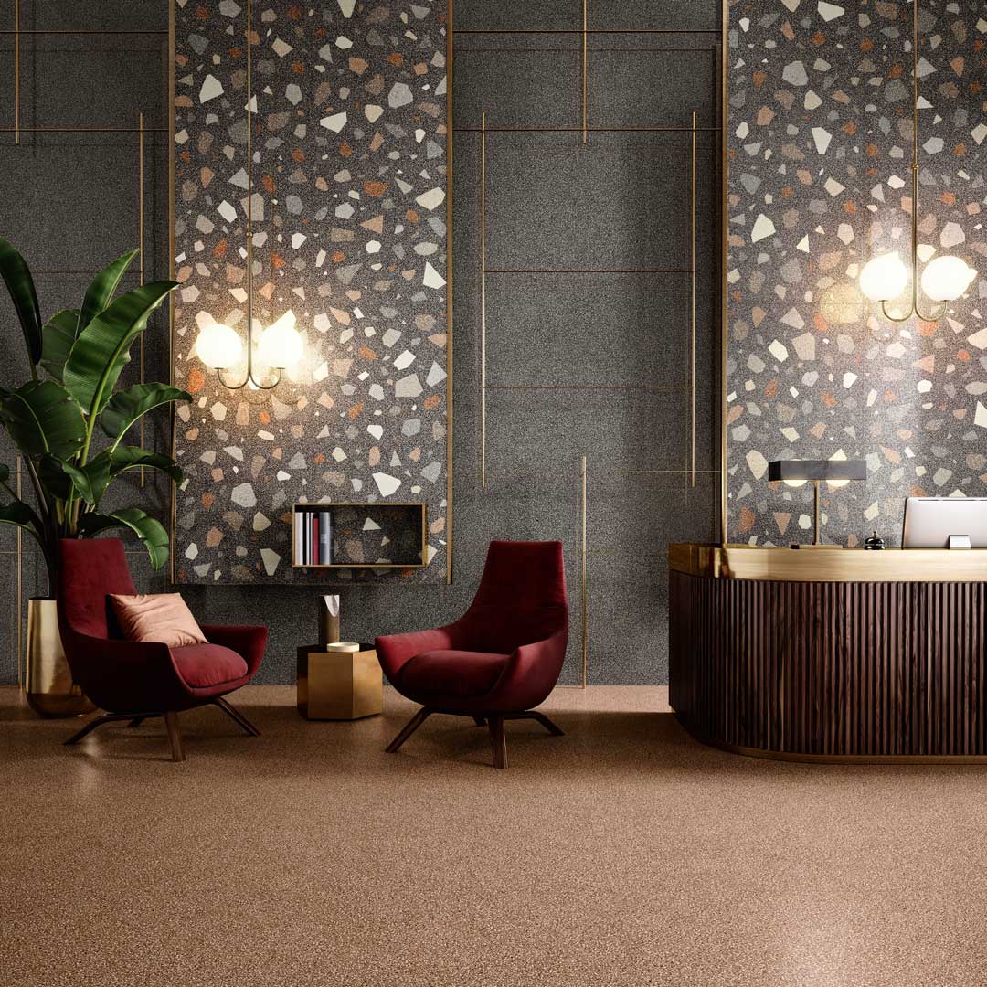
Side note: Terrazzo floors are taking over from concrete and screed in popularity; this exciting surface brings colour, personality, bold design and interest.
Faux Marble. Once the go-to glamour item of the rich and famous, and the finish we all believed would define us as having ‘made it’; marble and travertine are now far too costly, far too easy to stain and chip, way too difficult to maintain, and, most importantly, no longer a sustainable option. High tech digital printing technology has created an unbelievable variety of options and colourways. Italtile stocks a ‘marbleous’ collection of incredibly beautiful and luxurious marble-look porcelain tiles. (We are also seeing these XXL slabs being purchased for use as kitchen countertops.)
Geometrics. A very upward trend this year, and it’s EVERYWHERE! On cups, notebooks, wallpaper, bedding, art, floors, light fixtures, tiles, fabrics, furniture… basically anything with a surface area large enough to take a pattern! It’s easy to overdo it; but these eye-catching patterns aren’t going anywhere soon, so the secret is to find geometric balance.
Floral Wallpaper. Florals have been with us forever, but there’s a big difference between the ‘mumsy’ rose sprigs and daisies of the eighties and the dynamic floral interiors of 2020. Wallpaper trends are creating ‘monumental’ botanical tributes; oversized works of art that feature flowers and foliage in both super real and abstract designs.
3D Surfaces. High design around the world is including textured surfaces with very tactile variations, like 3D wallpapers and tiles, marble and stone cladding, wavy surfaces and frosted glass.
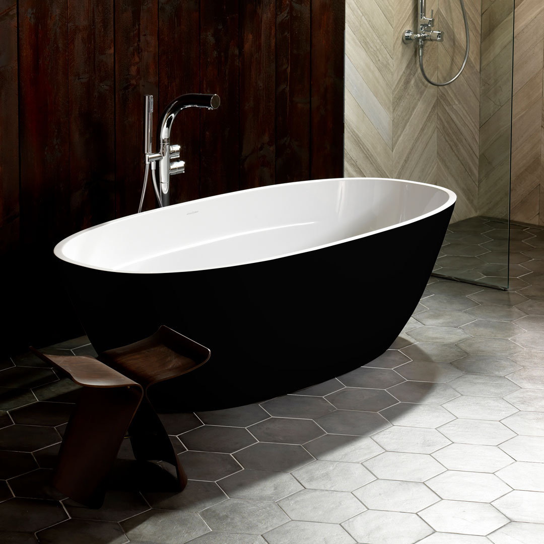
Last but not Least: Black is Back. And it’s bigger than ever. Whether mysterious matt or glamorous gloss, black adds instant sophistication and elegance. Cabinets, sinks, tiles, taps, paintwork, furnishings and countertops (even black baths), all make a modern home look high end, on trend and sleek. Some homeowners have stayed away from black in the past because the assumption is that black sucks the light out of a space and makes it claustrophobic. Clever interior design combats that problem by including contrasting colours and smart lighting solutions.
But what’s right for you? So many trends, how can you possibly import them successfully into your home? The important thing is to be aware of what’s happening in the design and décor world. Rather like fashion, not everything suits everyone. It’s not a one size fits all world. You will be naturally drawn to one or two trends and looks. You may decide to keep your grey on grey… but give a nod to colour with gorgeously rich velvet cushions in jewel-bright colours. You may be horrified by the thought of an invasion of houseplants… in which case, how about a tiny succulent in a pot on your work desk? The key is to personalise the look. If you’re not comfortable with it, chances are, your guests will feel it, too.
Melanie’s last word on the subject: “A new chapter begins every time you breathe life into a tired space. It’s like you’ve given that space a fresh start, a chance to really come alive.”
Bring the trends home, make them your own, and breathe new life into your home.
Want to Start a New Chapter? Melanie Ewing offers staff training, private design consultancy as well as decorating and design courses for all levels – from design dummies to professionals. View her latest projects on FB, Instagram and Pinterest. If you’d like to refresh your career, or need further design advice, contact her at info@chaptersinteriors.com


Validate your login