What’s on winter’s colour wheel? What will the best-dressed interiors be wearing? Style mavens around the world have spoken and you can colour us excited. Because while the variety is dazzling in its inclusivity, one theme emerges. HAVEN. Everything we live for. Cocooning, Sanctuary, Zen, Soothing, Serenity, Nature, Healing. All the words that lead us to rich warmth, welcoming embraces and unwinding spaces. Which, incidentally but not unsurprisingly, are all the vibes that inform our worldwide searches for the most gorgeous high-end tiles, taps, baths, bathroom furniture and finishes.
You’re going to see basic, unfussy but ultra-luxuriant neutrals. All the rich, healing hues warmed by nature. Some vintage-inspired vooma (we’re coming for you, avocado!). Bold vibrancy. Botanicals will continue to grow. And the watchwords are organic, artisanal, earthy and sustainable. Dopamine Dressing and Décor will continue to join the conversation, but not in quite the headrush hit of 2022 with its Barbiecore Pinks and Kermit Greens. Phew.
As with fashion, so with interior design, when it comes to ‘fit’. The first question to ask is ‘what colour suits me’. The starting point is to ascertain whether you’re a ‘cool’ or ‘warm’. Don’t just plump for popular, choose the feels that resonate with your personality. As always, when in doubt, #justask our design-certified sales consultants.
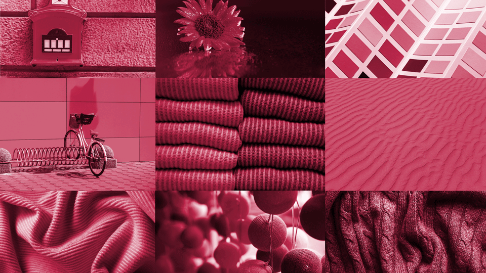
Viva Magenta. Millions of column inches have already been written about this juicy very-berry pinky red. She’s a party animal and she loves to dance with turquoise and is equally buddy-buddy with khaki. Let’s just caution you not to invest heavily here. How about a vibrant throw and some velvety scatter cushions? It’s a kind of show-that-you-know nod to a very powerful colour of the moment. However, get smart and find a tint of this powerhouse colour that has a more lasting appeal. For example, Italtile’s Morrocotto Rustic Brick Tile range has a gentle Rose if you’re a little colour-shy and blush easily!
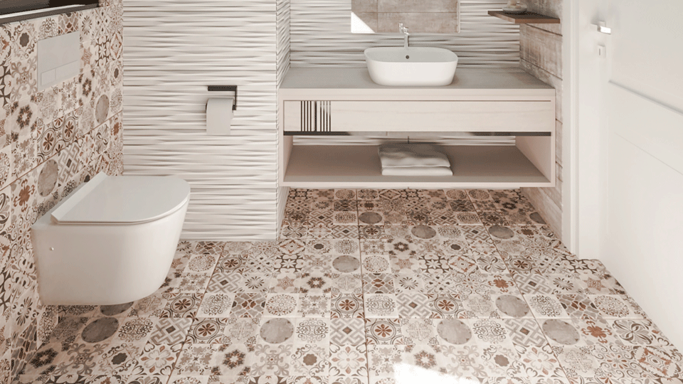
Earthy Orange. From the flames in our outdoor fire pits to Africa’s dramatic bushveld sunsets, this hue might be winter’s big noise, but it’s equally happy in a summer setting. In décor, it’s a good team player with camels, caramel, honey, greige and bronze. So, we’re lining up our rich, warm Retro Patchwork Matt Glazed EcoTec Porcelain range for you. Or if you’d like a little more fiesta, step right this way with the pure pigment of our special-order Piccolo Orange Gloss Ceramic 100 x 100. Now there’s a fiery backsplash for you!
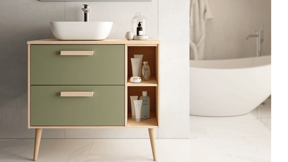
All the Greens. Especially Olive. Oh wow, the sea of green in 2023. If Nature was a Country, Green would be its Capital. Boss of all the biophilic hues. Honestly, we reckon it’s becoming a new neutral. Deep forest moss, ocean wave blue-green, the lime-green of new grass and buds, and all the herby have-to-haves like sage, eucalyptus, olive. Oh, and an emerald that is sort of Kelly-green-adjacent, only richer. On the olive front, may we respectfully guide your questing eyes to our drop-dead-gorgeous Coachman Vanity 800 in Olive. Graceful, tapered Nordic lines in pale wood, with drawers finished in a divine olive green.
Earthiness. The endlessly calming colours. Warm vintage browns, from sand to taupe to amber to dark chocolate, along with the beiges, stones and terracotta tones. They are trending like crazy, but we’ve been curating these shades since forever. Because timeless elegance. Think Exence by Atlas Concorde. Or the rustic charm of Barnwood. Or the time-worn stone vibes of Aix. And let’s factor in Rockstone and Glamstone with their unique, velvety INOUT grippiness.
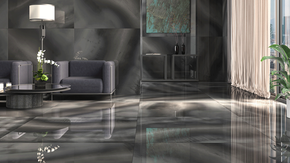
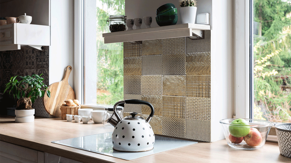
Metallica. We’ve loved watching the rise of metals in recent years and it was a thrill to know we’ve been getting it right with our metallic ranges when we eyed the Cersaie 2022 ranges featuring coppers, golds, bronzes and treated steels. We’ve just unpacked the most amazing example of the Metal Effect tile trend – Seattle. Take a look and you’ll agree there’s elemental alchemy going on here, with mirror, metal and porcelain creating magic and pushing the boundaries of what a one-dimensional porcelain tile surface can achieve. Then, gaze lustfully upon our highly textural, artisanal-style Global Stone Embossed Tiles in Metallic Gold. You could always bring a restrained glimmer to your bathroom sanctuary with our lush Matt Gold Verona tap range. Or our exclusive Dominus Accessories in sensational metallic hues.
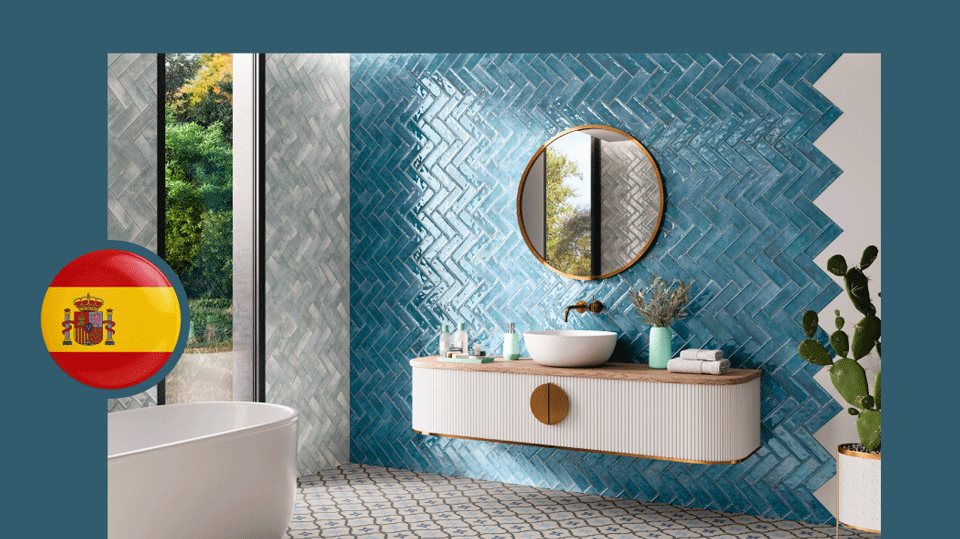
The Moody Hues. Designers are calling these the ‘It’ colours of 2023. The jewel tones and the spice tones. Deep Sapphire Blues and Indigos. Rich Aubergines. Cinnamons and Paprikas. Deep Forest Greens. Charcoals. Wine-dark Burgundies. These are bold and uncompromising colours and need to be approached with care (and an expert eye that understands lighting, too). Kitchen cabinetry and kitchen islands are going moody to great effect. Italtile has some achingly beautiful moody hues; front and centre, you’ll spot the richly glazed Vogue Subways in forest-green Esmeralda and dramatic Denim. Or our Emerald, Smoke and Sapphire KitKat Tiles. Then there’s the drama of our Bluzee Sage Polished Glaze Porcelain Tiles and the dazzling midnight sparkle of our Volga Blue Glazed Polished Porcelain Tiles.
Beige. Although she hangs around with earth tones, she’s a very special VIP this season, and will continue to take centre stage for years to come. Beige lives in the heartland of Luxury City, knocking grey out of the limelight. It’s the quiet, ‘blank canvas’ that says so much about your taste without speaking one word! Loves layers and plays nicely solo, too. We’re thinking the high-end porcelain tile deliciousness of Elementi Beige, Glamstone Beige, Pienza Avorio. The oatmeal marble-ousness of Armani Beige. Our new-age 2cm Pavers. Then there’s the limited-edition, special-order, rustic chic Provenza Ceniza 130 x 130 and the light blush of Piccolo City Light Beige 100 x 100. Both ceramic tile masterpieces that’ll add subtle luxe to a backsplash. You’ll find our massive lookbook of calming beige instore and online.
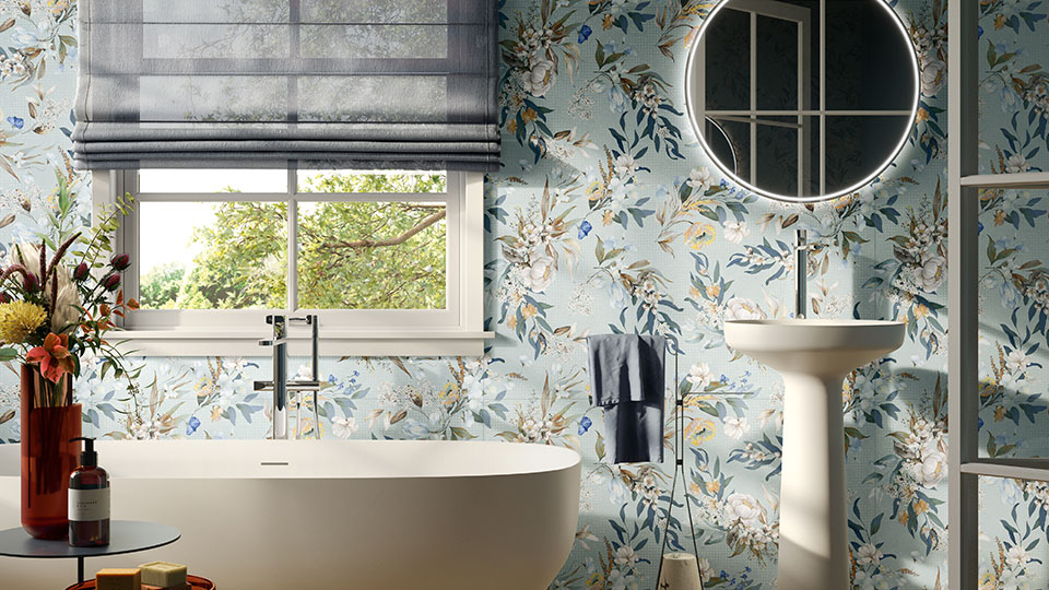
Italtile offers endless colour, endless choice. Once you’ve created your background canvas (hello beige and friends), layer it up with texture to add dimension. Then, and only then, will you splash out on the trending colours. Can’t decide what’s going to be your ‘pop’? Then allow us to guide you to our patterned tiles, patchwork tiles and mosaics. All the sun, citrus and sea colours of La Med in Vita Sole Mix Luc. Or the honeyed mood of Retro Patchwork Glazed Porcelain EcoTec Floor Tiles. Or the soft flaxen charm of Howard Blue Matt Glazed Porcelain Tiles. Or some wall art with bang-on-trend Wallpaper Print Tiles – Sable Jardin and Sunwood Jardin, luscious botanical porcelain tiles dreamed up by our innovative friends over at Ceramic Sant’Agostino.
Bespoke V&A bath colours. The luxury of choice. Did you know that at Italtile, you can colour match your V&A bath to your bathroom colour scheme? Come and consult with one of our interior design certified sales consultants to select the V&A bath of your dreams in your choice of colour, from the RAL colour system. The RAL colour system consists of over 2 000 colours, each identified by a unique four-digit number. (Developed in 1927 in Germany, RAL is a colour matching system for powder coating, used by professionals in architecture, industrial design and automotive manufacturing.)
Colour your life with Italtile. Keep us close as you dive into the deliciousness of the moment, confident in the assurance that Italtile’s inimitable brand of timeless elegance, sustainability and upscale style will help you translate the ‘looks du jour’ in ways that will best speak to your personality and taste. With our carefully curated collections of local and imported tiles, taps, baths, sanware and more.
Stick with us, baby, and we’ll show you how to own the tones, curate your haven, colour your life and live beautifully.
Ciao!


Validate your login